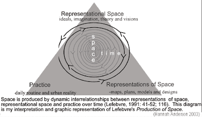
The building itself is apart of huge complex called 'The Light' a large complex filled with shops, restaurants, hotels and a gym. The section of the building that I work in is the Starbucks, a place for people to sit and relax and communicate with others. It is designed to be the 'third place', the people that they consider after their home and their work. The space that they are wanting to create is what Lefebvre calls a 'Representational space', a space that has been planned and thought about to create certain feelings as aposed to just four walls that hold up a ceiling.
The practical use of the space is used by people and is made a part of their daily routine. They make it an urban reality by using the space day in and out. Some customers come to our store more than 3 times a day for their caffeine top up. These customers are the people that make this building the space it is. When working there I have looked at the building itself, and it is far from perfect. The colour combination used on the walls alone are anything but homely and comforting. the shop itself is a long corridor, hardly the set up that makes a place easy to communicate and relax. But the connotations that are attached to the word 'Starbucks' make people walk through our door regardless of the interior image of the room.
Moving on to the last part of the diagram above with the representations of the space, the designs and the models. The practicality of the space is mainly one to be functional as aposed to one to create a relaxing atmosphere. As someone who works their instead of being a customer, I notice all the parts of the building that have been designed to go un noticed for our convenience. So the space that is created in the mind of customers was an idea created by designers, but the design of the building for functionality is kept separate from the customer.

No comments:
Post a Comment