Friday, 25 March 2011

Task 5 - How to read a photograph

Photography is used in many ways, for landscapes, portraits, documentary’s, and art. For every purpose that photography is used it is creating a new meaning, because when we view an image of photography we don’t actually view it as an image, we read it, as if it were text. In Clarke’s (1997) text “The photograph” he states that the “photograph both mirrors and creates a discourse with the world, and is never, a neutral representation”. Because we do not read a photograph as we think we do, we are not free to read the photo as we think we are. Every aspect of a photo has been created by a photographer, this is what many people often forget. For example the image below by Don McCullin (1968) is an image of his from the Vietnam War.


McCullin D (1968), "Fallen North Vietnamese Soldier" http://www.vam.ac.uk/images/image/41127-popup.html

As a photojournalist most of his work is of scenes that are uninterrupted by himself. However in this image McCullin actually edited the way we read “the photographic text” (Clarke 1997) by placing the belongings of the murdered man in this way. Although the scene that he is photographing is already deeply unsettling and saddening he has added to these awful feelings by rearranging the scene. He has opened the wallet of the man who has just died, opened it to the page with a photo of someone he no doubt loved. We do not know that he loved this person, but it is one of the connections that we assume without realising. He has also placed the wallet just past the reach of the man’s hand, making it appear as if in this man’s last minutes of life he is reaching for the last bit of family contact that he has. Also placed among his wallet is a small opened box of possessions, with more passport sized photographs and a bag of unused bullets.

This photo has been arranged with our victim at the top of the frame, however the angle of the photo itself has been taken so that the lower of the image is in the foreground. Therefore we read the bottom of the image first, all the victim’s belongings. Then from these we notice the man’s hand, almost as if it is part of the rubble on the floor, then we work our way up, and by this point we do it reluctantly as we have already made the assumptions to what that hand is attached to, to the body of the man that has lost his life in war. We do not need to realise any other part of the image, every other aspect we have already assumed, this is where the photographer has real power as “what we see in a photograph and what we are asked to view”. The ways that we read photographs must always be carefully throughout, as in most cases the photographer wants everybody to read the photograph in the same way.

Thursday, 24 March 2011

Portfolio Task 4- Post-modern graphic design.

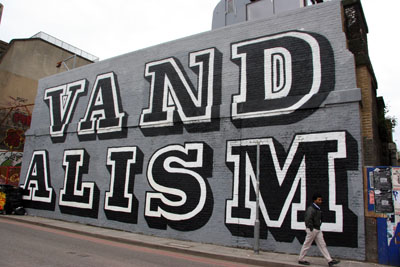
Post modernism is a move away from the failings of the modern. however in graphic design it could be seen that the post modern was more of a continuation or a re evaluation of the modern. Graphic design made a massive serge in the second half of the 90's towards cultural design for example graffiti;
  

The dream that modernism could improve living conditions after WWII never came true, instead lots of quickly and cheaply made housing was made. Living in these conditions it's no wonder that people wanted to object against it, by creating artwork/graffiti all over the exterior of the ugly buildings. Above is an image by EINE in London, his pieces are thought to improve the surroundings in which they are illegally placed.

Much of the post modern feeling was about freedom from the modern, and freedom from the war.
The image below is a replica of the 1939 poster "Keep calm and carry on" which was made during war times by the Ministry of Information to keep spirits high in war time.

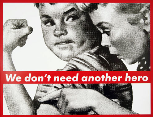
Graphic Design greatly influenced pop art of this time, effecting the work of Roy Lichtenstein, Andy Warhol, and a lady I would like to focus on, Barbara Kruger. Her work is made of collage, mixing media, expressing a freedom which design once didn't have. Her work is also like the images above where they are highly motivation pieces for the rest of the population.


This image above is the original photo taken of Marcel Duchamp's "fountain". This was an incrediably controversial piece for it's time. Duchamp was slightly before his time in creating this "ready made" art. He made people look at common objects in a different light, very much a post modern idea. From looking at this image many critics believe that by placing the urinal this way up he was symbolising other things, for example a Buddha. I'm not sure if I agree but it defiantly has been created with a post modern feel of rejecting all the conventions of the modern.


My last image brings a bit more colour into my look at post modernist graphic design. I said earlier that Andy Warhol was influenced greatly by the post modern graphic era. This image above is made with very bright colours, many people think this is to represent the character of Monroe. However, I believe this is Warhol's way of showing the fake aspect of "the celebrity", deliberately not making his images perfect and making the contrast of the colours almost painfully bright. This image is using many of the conventions of post-modernism by being socially challenging. 


Friday, 18 March 2011

Portfolio Task 3- The Avant Garde

In approximately 300 words discuss the concept of the 'Avant Garde' in relation to two examples of Graphic Design. Include pictures and full references to the works you are discussing.

The literal definition of “avant garde” is from the French Advancing Guard, literally paving the way for others to follow. Over the years the weight behind this meaning has slightly changed, as it no longer means making innovative and progressive art but it simply signifies uniqueness.


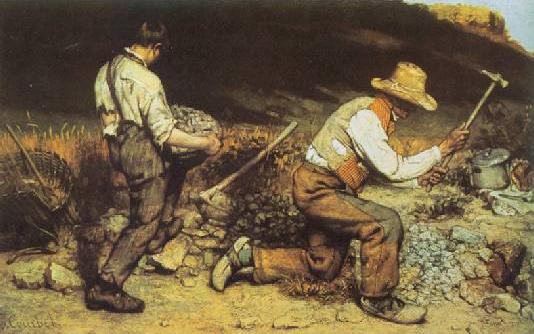
The painting above (Courbet 1850) was a scandal of it’s time. The image was inspired by the “complete expression of human misery”. This is an example of political avant garde. The Avant Garde was often used in politics as it means to stand out, be different and express opinions. This painting showcases the forgotten people, turning the mundane into art. This would not normally be the subject of high art and is made to lead and challenge conventions.


Another artist that has made art to lead and challenge conventions is Roy Lichtenstein. Alike Courbet he took something that wouldn’t usually be seen as high art, recreated it and showcased it in a place making it worthy of being considered high art. Lichtenstein took images straight out of comics and blew them up to a huge size, and placed them in a gallery. The process of doing this I believe is paving a way for other people to consider the amount of skill and art that goes into comic art. He is making a point and making it well.