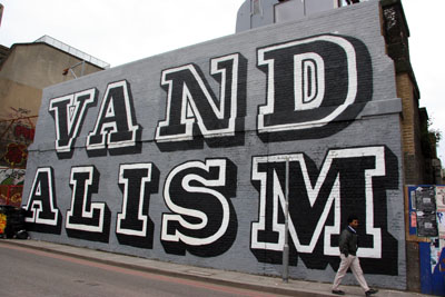
EINE (2007), vandalism,London http://www.artofthestate.co.uk/graffiti/eine_vandalism_graffiti.htm
The dream that modernism could improve living conditions after WWII never came true, instead lots of quickly and cheaply made housing was made. Living in these conditions it's no wonder that people wanted to object against it, by creating artwork/graffiti all over the exterior of the ugly buildings. Above is an image by EINE in London, his pieces are thought to improve the surroundings in which they are illegally placed.
Much of the post modern feeling was about freedom from the modern, and freedom from the war.
The image below is a replica of the 1939 poster "Keep calm and carry on" which was made during war times by the Ministry of Information to keep spirits high in war time.
Ministry of Information (1939) http://www.keepcalmandcarryon.com/products/keep-calm-and-carry-on-poster
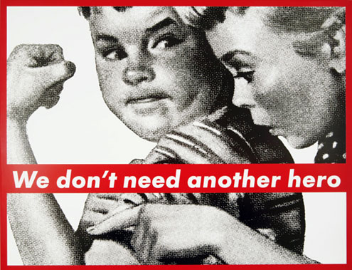
Graphic Design greatly influenced pop art of this time, effecting the work of Roy Lichtenstein, Andy Warhol, and a lady I would like to focus on, Barbara Kruger. Her work is made of collage, mixing media, expressing a freedom which design once didn't have. Her work is also like the images above where they are highly motivation pieces for the rest of the population.
Kruger B (1987) untitled. http://www.maryboonegallery.com/artist_info/pages/kruger/detail2.html
Duchamp, M (1917) "Fountain" http://www.tate.org.uk/servlet/ViewWork?workid=26850
This image above is the original photo taken of Marcel Duchamp's "fountain". This was an incrediably controversial piece for it's time. Duchamp was slightly before his time in creating this "ready made" art. He made people look at common objects in a different light, very much a post modern idea. From looking at this image many critics believe that by placing the urinal this way up he was symbolising other things, for example a Buddha. I'm not sure if I agree but it defiantly has been created with a post modern feel of rejecting all the conventions of the modern.
Warhol A (1960) "A shot of Marylin Monroe" http://www.marilynmonroeart.net/marilyn-monroe-painting/andy-warhols-marilyn-monroe-art
My last image brings a bit more colour into my look at post modernist graphic design. I said earlier that Andy Warhol was influenced greatly by the post modern graphic era. This image above is made with very bright colours, many people think this is to represent the character of Monroe. However, I believe this is Warhol's way of showing the fake aspect of "the celebrity", deliberately not making his images perfect and making the contrast of the colours almost painfully bright. This image is using many of the conventions of post-modernism by being socially challenging.


No comments:
Post a Comment